BRANDING
THE CHANGE,
HOW DO I WORK?
moeder & dochter
connecting
female
generations
BRAND POSITIONING | BRAND STRATEGY | CREATIVE DIRECTION | ILLUSTRATION | WEBSITE DESIGN | COMMUNICATION
The Dutch coaching practice Moeder & Dochter (Mother & Daughter) was founded spontaneously, a small side project of 2 experienced coaches (mother and daughter) who support executives and managers in daily life. They often saw other daughters and mothers struggling and started a few workshops to connect mothers and daughters more closely. Other individual projects soon followed, such as a dedicated card deck, a podcast with well known mothers & daughters, collaboration in a theater piece, etc.

‘Moeder & Dochter’ has grown, it is no longer a side project. The podcast is successful and they have ambition for larger events. We are looking for cohesion between the various projects they do, where they are positioning themselves, and who they want to attract. Eventually, this should be translated into a new (digital) identity.
First, we look at what M&D stands for. The time for a cozy tea party is over. A lot has changed in the field of women's emancipation, but intergenerational patterns are still being passed on (whether we want to or not). There is a need to break these patterns and a need for connection and empowerment.
The founders are convinced that if you are open to each other, if you seek connection and listen, a lot has already been achieved in a relationship. This does not require a long, heavy therapy session, but rather a short, powerful day of workshops, varied assignments, lightheartedness, and humor.
With this mission in mind, we look at the projects M&D is currently doing. It immediately becomes apparent that there is clear cohesion. The different offers complement each other. From passive, and accessible to active and intensive. M&D should therefore be seen as a platform for every mother and daughter looking for connection, regardless any age. For those who do not need years of therapy sessions, but want to get started right away. For those who want to listen passively and with interest. For those who are looking for an easily accessible connection through playing cards. And for those who like to be active in workshops, whether it’s just with daughters, or more intense with both mothers and daughters. These 4 tools (the podcast, the card deck, and the 2 workshops) form the core of communication.
Their drive and core values are translated into a new identity, a brand tool, a new website, an updated social media appearance, and a communication strategy & roadmap. A clear content calendar is drawn up, which focuses on opening up, connecting, listening, and female empowerment.
For the color palette, the existing palette is looked at and minimized. The serious tone translates to solid colors such as burgundy, dark blue, and camel, the lightheartedness is sought in vivid colors such as hard blue, fresh green, and pink.
The neutral font is maintained, supplemented with 2 new fonts; a tilted font representing the different perspectives and, an irregular font standing for the difference in generations. The copy is cheerful, personal, and inspiring.
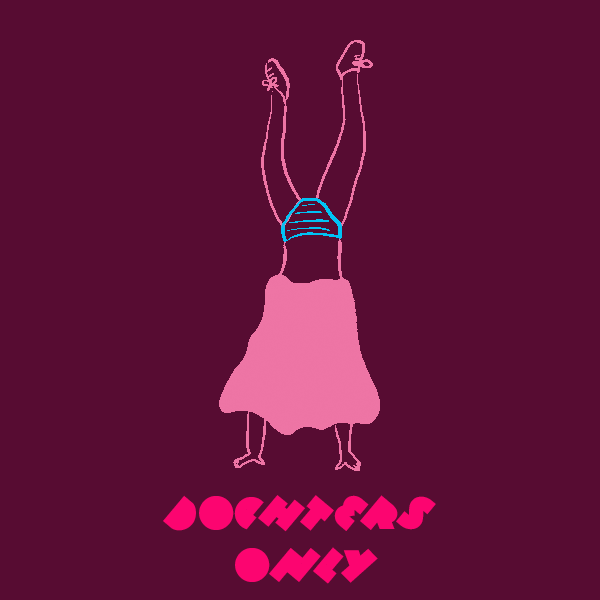
To add a sense of humor, strong, female-empowering, witty illustrations have been used. It avoids picturing people in a private setting and still maintains a sense of familiarity. In addition, the founders both receive a personal illustration with speech bubbles. A nice way to stay connected and to talk 'directly' to their target audience.
Yes, Moeder & Dochter has grown and 'speaks' like never before! www.moederendochter.com